Visualisation of Development - How big is it?!
I chaired the working group that produced the Landscape Institute's Technical Guidance Note "Visualisation of Development Proposals" (TGN06/19)
Over the last year and a half, we have been advising our Local Planning Authority on Landscape and Visual Impact Assessments and their accompanying visualisations, for a range of major projects and Nationally Significant Infrastructure Projects (NSIPs). Of the visualisations that we are seeing, one main criticism stands out. It is not something that the guidance currently advises upon, but it has the potential to mislead stakeholders, when viewing visualisations, as to the scale of the proposed development.
Larger development visuals are often presented on A1 sheets. Almost universally, this no longer means printed pages held up in front of the viewer, but PDFs. When these are opened on a typical computer screen (or worse, a tablet or phone) the whole page is viewed on screen at a fraction of the scale orignally intended. In fact, when an A1-width visualisation is viewed on a typical 24” diagonal computer screen, it would be around 50% too small.
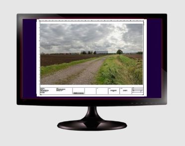
Unless told differently, the typical view would be this - but it is not an A3 drawing sheet, it is A1, which is two times wider or four times larger...
Unless the viewer is really paying attention, they will not be aware of this issue. For example, a 90-degree field of view on a page, for a linear infrastructure project, should not be viewed on single screen. It should at least be viewed across two adjacent screens, zoomed in to 100-125%, and sometimes larger than that, to obtain the correct scaling.
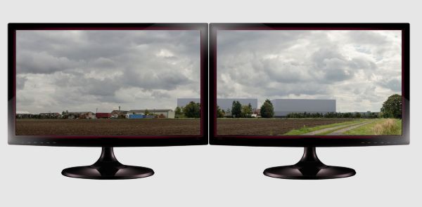
But in fact it should be this.
The following images give a sense of how different the scaling of these images is, subject to the Zoom setting of the PDF viewer.
This is viewed at 47% 'zoom-to-fit' in the PDF viewer
...and this at 125%, which is much closer to the experience of viewing the proposal as it would be seen if it was built
One mechanism, which some practices use, is to draw a simple 10cm ruler, for use as a scale bar, below and central to the image, with the instruction to zoom in until this ruler measures 10cm on the screen. At this point, the visualisation is the right size in front of the viewer.
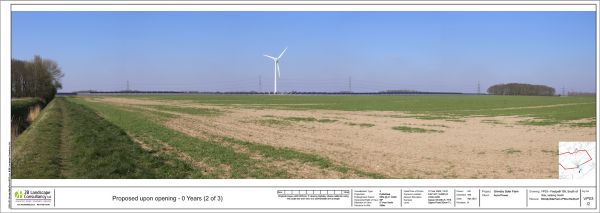
For this solar farm visualisation, we implemented the '10cm ruler' approach
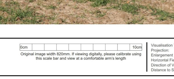
This is what it looks like close-up.
All viewers of Photomontages (and photographs) for LVIA/LVA purposes, should be aware of the size of the PDF they are viewing, and be aware of the appropriate scale, in order to correctly view the potential effect of the proposed development. But they cannot be expected to automatically know this.
So, there is a need to implement simple approaches, such as providing a scaling ruler, but also to make the visualisation producer responsible for communicating, to stakeholders, how they should be viewing the visualisation to get a realistic sense of scale.
There are proposals to review TGN06/19. Implementation of the above suggestions would result in a truly meaningful improvement in stakeholder engagement through visualisation.
Bill Blackledge CMLI